
Overview: A website that helps parents, advocates, and policymakers get up-to-date information on pregnancy and early childcare resources and policies.
Problem: The NCIT didn’t have a website or social media, and in today’s society, a website and social media accounts are necessary to communicate information and to get information out quickly.
Solution: We designed a website for desktop and mobile, and social media posts for Instagram and Pinterest to increase engagement and share information.
Client
National Collaborative for Infants & Toddlers
Timeline
Q1 2023, Q4 2024 - Q1 2025
Programs
Figma Canva Adobe After Effects
Skills
Product Design, Animation, Design Systems, Graphic Design, Prototyping, Research, Social Media, Collaboration
Role
UX Designer + Visual Designer @ Studio Mosaic (Collaborators: Junior Designer, Senior Designer, Creative Lead, Project Managers, Developers)
Industry
Healthcare, Nutrition, Advocacy, Kids
Website
Metrics
Simplification and Templatizing Milestones Helps
Increase in Brand Partnerships from around 200 to over 500 partners
Brand growth contributed combined with company trust, contributed to an increase in partners, but also a rethinking of how large content sections are displayed.
Over 3K followers in 1 year on Instagram
Collaboration between the design team, PMs, and content managers contributed to an increase in followers as well as an established design system for posts.
Background
Research and Looking to “Play” to Reach Family Demographic
They needed a website and socials to go with their brand refresh that accounted for how people get content, and in today’s society, that’s online. NCIT didn’t initially have a website or social media and had just been acquired by The American Heart Association. The site needed to account for desktop and mobile layouts, and the socials needed that animated, bright, and energetic factor that most children’s content has.
Discover
Design
Test
Launch
Process
Discover
Learning about your users through Play and Research
When I started, I didn’t know much about child development and advocacy within this space, so research played a big role in the style and direction. I wanted to understand how their target audiences digest content (websites, social media, television, etc.) and what elements can keep them engaged. Indirect competitive analysis through looking at the branding for grocery store baby food, watching children's animated television, and researching toys was used to strategize a style that could work across desktop and mobile. Creating a website and social posts helped to leverage the way that people currently learn about new information.
What We Already Knew?
Demographics - Primary Focus: Moms; Secondary Focus: Families, Policy Makers, Advocates, Minority Communities
Imagery Options - Focused underrepresented families (African American, Asian, Latino, LGBTQIA+, etc.)
Engagement - NCIT needs to grow their community to increase early childhood development advocacy
None to Little Website or Social Presence - Previously NCIT had little to no online presence and felt very medical from their original logo
We used a mixed-method approach:
Primary Research: Primary Research: current in-store products for food and toys
Secondary Research: online research, tv shows, social media, children’s brand-focused websites
Qualitative: informal interviews, feedback

YUMI

Plum
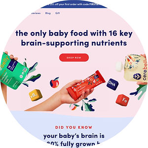
Cerebelly
Results from the Mixed-Method Research Process.
Children’s Content leans towards Bold, Bright, and Energetic - I wanted to understand children's content better, so I did a competitive analysis of children’s brands (toys, shows, etc.). This initially was sparked by the interview Cas Holman did on Netflix’s Abstract to talk about the concept of play and her invention, the Rigamajig.
Social Media & Digital Content Matters MORE - To further understand, I conducted informal interviews with new parents and soon-to-be parents to understand how parents gain information on childcare topics. The answer that popped up a lot was social media.
This concept of “Play” moves through everything created for NCIT.
Examples can be seen in how we chose to combine play (toys) into the website design to produce better engagement, and having the toys, food, drinks, etc., do a little animated wobble, like how toddlers walk when they take their first steps, for the social graphics. The interest peaked from looking at the social media pushes families, policymakers, and advocates to look for more information on the website and vice versa...almost like the game of tag.
From this research, I was able to validate and confirm these goals:
Engagement: Creating space for families, advocates, and policy makers to find our more information on child development through social media
Easy Navigation: Easier to navigate for the user to find what they’re looking for
Advocacy: Helping people to know more about child development
How might we...


Design
Design Begins to Have Problems of its Own
Throughout the research process, the senior designer and I would have short meetings to go over the initial moodboarding and research finds. It was also established early on that the website would be launched in phases as NCIT was/is still in its infancy. At this stage, it would have been helpful to create personas to refer back to to keep the users in mind through past, present, and future processes, but another time. Using the research, the senior designer created the initial design for the homepage, which I then used to build out the other pages on the website and tweak the homepage where needed.

During the design process, one of the trickier intuitive sections was the rattle design on the homepage for the “What Can You Do” section. This section was inspired by the “Play” concept, and sketches were needed to understand how the parents, advocates, and policy makers could best use it. This section, however, didn’t take into account that we may be overcomplicating a section that may only need a simple answer, but you'll hear more about that in Launch 2 below. But for now, there's Launch 1 of the website and additional awareness of the brand created through social media.
Launch of Phase 1, aka Launch 1 in 3, 2, 1...
Launch/Phase 1
We launched the website with all of the approved sections and pages.


Playfulness continues but now let’s slide in some animation.


Launch/Phase 2 Discovery & Solutions
Creating New Solutions after User Feedback
Once the PMs and NCIT evaluated the new experience, we were able to synthesize changes for Phase/Launch 2 to see that the new design didn’t account for product growth, especially the quick growth that could come from child-focused brands. The organization's partners went from 200 to over 500 partners in the span of two years. Simultaneously, NCIT socials grew to over 3,000 followers in a little over 1 year on Instagram, which further validated that need.


Experimentation Leads to Shorter Above-the-fold
Problem: They wanted to experiment with different options for the hero/main image or video when you come to the site. The longer hero section took up too much real estate and pulled focus from important information.
Solution: I worked on a few options, and they ultimately went with a shorter image for the homepage, so the top image isn’t covering so much of the screen.

New Understanding of Company Needs
Problem: The events section needed to be separated from the news section since they didn’t have too many events. Instead, they wanted “Events” moved near the top of the page and to showcase more of their latest work.
Solution: Design a Latest Work section of 3 boxes that link to toolkits, events, and petition forms.

Fast Growth is a Good Problem to Have
Problem: Their partners' list was fast-growing, and so the current design made it hard to navigate on the home and internal pages. Also, they wanted a more effective way to display some of the partners on the homepage, but also create a tier system for them.
Solution: Create a moving carousel of the steering committee members’ logos and have an additional section that explains the membership and leads to the full list of members.

Making a Complicated User Experience Simpler Reduced Cognitive Load
Problem: The “What Can You Do” section is hard for people to use, so we need to find a clearer, more simplified way to navigate it.
Solution: Changing the rattle to a button section with clear labels and a single instruction line to click the icons for the supporter type.
Simplifying Your Answers is Sometimes the Answer to User Goals
Through out this process we tried to keep it fun and simple. Overcomplicating the design only pushes away the target demographics: families, advocates, and policymakers. I also learned that in working with an ongoing client, you’re never really done.

Learnings & Next Steps
Conducting Surveys and Creating Personas Would Help to Keep the Focus for NCIT
When you aren’t familiar with a topic, it helps to ask others within the communities, which helps you feel more confident in what you’re doing as a designer. When you’re not confident in what you’re doing, you feel lost, which results in more time needed. Questions hold the power of knowledge and understanding.
If there were more time, I would have liked to create personas and user stories to help focus/refocus the consumer base: couples, dads, moms, young families, advocates, and policymakers. Sometimes, the designs can move away from their original intent, and having personas in a sharable space means that any designer, project manager, engineers, etc. can get context of the brand and their needs quickly. The research for the personas would come from the competitive analysis and initial informal interviews, plus surveys to understand how people gain insight into children’s trends, education, toys, nutrition, etc.
Have fun and keep it simple. Overcomplicating the design pushed away the target demographics: moms. I also learned that in working with an ongoing client, you’re never really done.